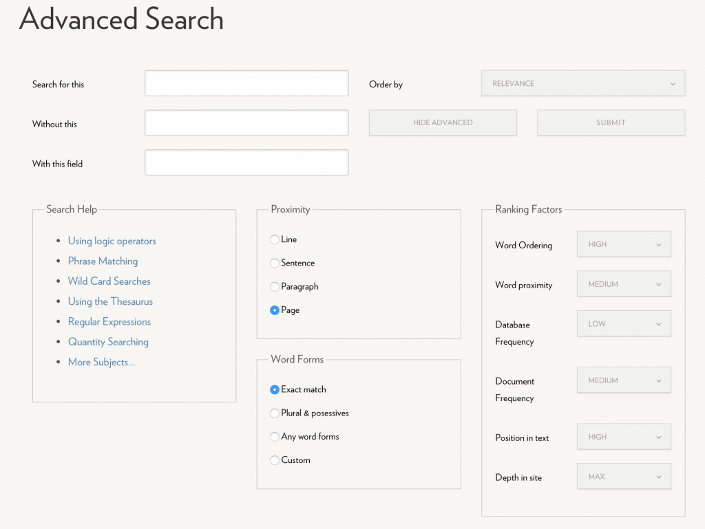
When we launched the new Hope College website in August 2015, we also launched a new site search tool, OU Search, powered by OU Campus – our CMS. Last week, we implemented a new feature of OU Search, Advanced Search, which allows users to have further control over the content they are searching on the hope.edu website. You can see the advanced search options in the screenshot below, or take it for a test drive on our site. Let us know what you think!
Against FAQs
1. How do you feel about FAQ pages?
Funny you should ask. I’m not a big fan. With very few exceptions, including an FAQ on your site map or your website is a sign that something is wrong with your content strategy.
2. Don’t FAQ pages add value to a website?
Not really. Most FAQ pages function as the junk drawer of a website — a random collection of little odds and ends that you couldn’t figure out what to do with. And, in many cases, they’re the result of having a poorly structured website.
3. But if I know my audience is asking certain questions, shouldn’t I put that information on my website?
Yes, absolutely. But that doesn’t mean you need an FAQ page. If you know the questions your audience is asking, write content that actually provides the answers.
4. But we’ve always had an FAQ page!
I know! Who hasn’t #amiright? But that’s not a good enough reason to keep it. Also, that’s not a question.
Look, if your content isn’t answering your audience’s questions, then you need to work on your content. This typically means one of two things: Either the content itself needs to be reworked so it better addresses your audience, or things are just too hard to find.
5. Ugh, fine. Then what should I do with all these FAQs?
Use them as a guide for revising your content. Really, don’t feel bad about having FAQs — they show that you know what your audience wants or needs, which is very important. Now take that information and use it to inform your content throughout the entire site.
6. How do I do that?
Go through your FAQs and identify which parts of the website are most closely related to each question. For example, if you keep getting asked about a registration process, make sure that information is clearly spelled out on your Register page. Or maybe people can’t easily find your Register page, so you need to rethink your navigation and hierarchy. In any case, once you’ve put the information in a place that makes sense, delete the question.
7. Okay, I used my FAQs to revise my content, and now I don’t have any questions left on my page. Now what?
Good! Now we can delete your FAQ page.
Snapchat: For our students
They say you have to learn to crawl before you can learn to walk. When it comes to adopting a new institutional social media channel like Snapchat, I am pleased to be crawling at a snail’s pace.
 Snapchat gets the largest share of attention from 18-24 year olds, and I have to admit: that made the Public Affairs and Marketing team a little nervous. We tossed around the idea of jumping into Snapchat for months, but we weren’t quite sure how, or what we would do with it. Would we allow our students to take it over? How might that work? These are big questions for our new-ish marketing team!
We didn’t want our students to roll their eyes and ignore us. We didn’t want to start something that would’t provide value to our campus. And we had to be intentional. With so many goals, it was time to call in the experts: our students. Would they engage with us? Would our presence encroach on their social media territory? How should we even use it?
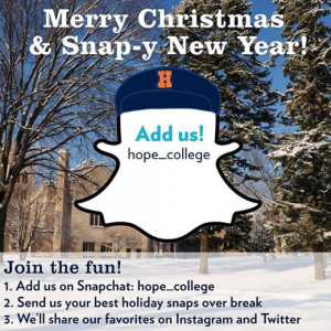 To our surprise, the response from students—and maybe a few employees—was something like, “It’s about time!” Hope on Snapchat seemed so obvious. Why did we wait so long? “It’s only Snapchat!”
Finally I decided to go for it. What’s the fun when there’s no risk involved, right? The Hope College Snapchat account hope_college was announced to students via Instagram and Twitter on the Friday before Christmas break as a three-week holiday campaign to keep our students engaged from home.
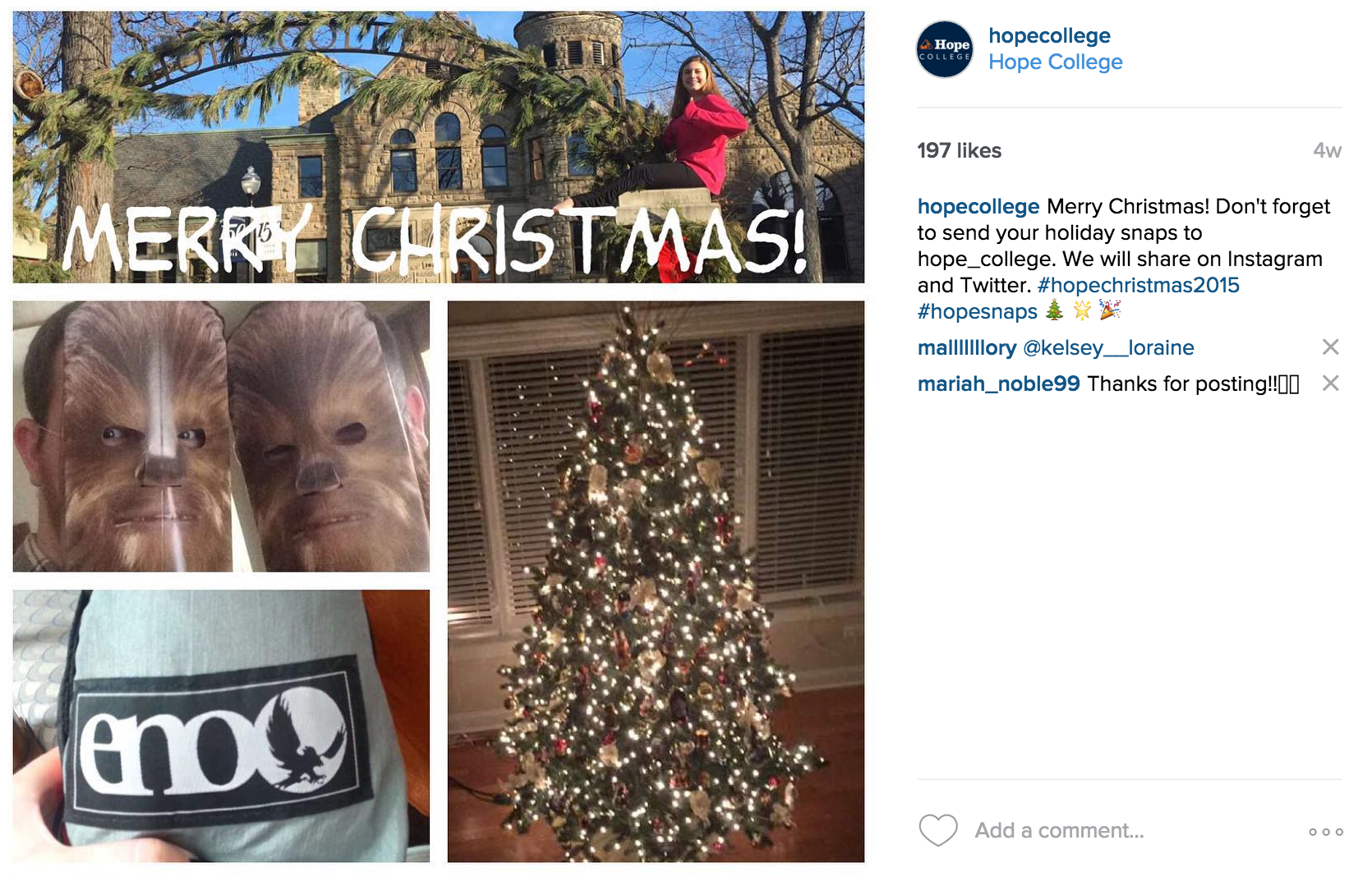
In our first campaign we collected snaps to share with our Instagram and Twitter followers. It was a chance for any of our students to become “instafamous.” The response was great! Within an hour we had all kinds of snaps sent to us. Emphasis on all kinds (see below). It was fun to see what our students received for Christmas and to have a glimpse into their family’s traditions. Apparently Hope swag was Santa’s gift of choice.
Since that first campaign, I have enlisted the help of a few trusted student workers to watch for incoming snaps. They are also adding original content to our Snapchat Story. A Story is a series of snaps (can be photos or short video) pieced together in a narrative that can last up to 24 hours and is only available on Snapchat. This is exclusive content not found on Facebook or Twitter. Pretty cool, huh? 
My intent with Snapchat has never been to use it as just another marketing tool, but rather a secret weapon for meeting our students wherever they are—about whatever they are interested in—in the moment they care about it. And because much of our content is created by students for students, there’s an added flare of authenticity not found on our other social media. Our faculty are even joining the fun!
Working with students to launch Snapchat has turned out to be an ideal partnership with teachable moments for all involved. I am able to manage the account and give direction while observing how our student workers are using the application. At the same time, they have freedom to be fun and creative while wearing the hat of a marketer. It’s going to be a lot of fun to watch what we do with Snapchat in 2016!
Add us! hope_college
Public Affairs & Marketing 2015 Annual Report
2015 was a great year for us in Public Affairs and Marketing at Hope College. It was our first full calendar year as a division, we added new staff, and we collectively learned how to swing dance. Okay, one of those things is not true.
But we also did a lot. A whole bunch, actually. We are grateful that we get the opportunity to work so closely with many departments, offices, and programs on campus who are doing amazing things. We love telling their stories.
Here’s a short sampling of some of our 2015 accomplishments:
- fulfilled 1,000+ print requests including business cards, letterhead, and name badges
- produced 30+ printed event promotions including Musical Showcase, Failure:Lab, Scholarship Day of Giving, Alumni Weekend, Commencement, Employee Picnic, Orienation, Bultman groundbreaking, KAM dedication, Presidential Colloquium, Jack H. Miller Center dedication, Homecoming, Christmas tree lighting, Hope Serves, and more!
- developed a brand for the sesquicentennial celebration
- completed brand and marketing work for HSRT and The Big Read
- updated graphics for buses and all Hope vehicles and parking tags
- generated marketing materials for De Pree Gallery
- developed 10+ custom apparel projects
- updated building signage in Phelps, DeVos, and VanZoeren
- instituted significant design changes to “News from Hope College” to enhance the publication visually
- refreshed Admissions junior and senior series, visit days, Day1 and Phelps Scholars series
- redesigned Athletics game day programs
- coordinated photography for dozens of events and several new buildings
- streamlined incoming student and parent summer communication
- launched the “Stories of Hope” blog to highlight scholarship and innovation on-campus and off-campus
- converted to online Annual Report of Donors
- launched new Hope.edu website including new calendar, site search, and Directory with Banner data integration
- introduced new online catalog with Banner data integration
- completed new WordPress blog theme
- launched new Snapchat account
- began online advertising campaigns
- developed new Board of Trustees e-newsletter
- published new documentation including OU Campus Users’ Guide, Social Media Guidelines, and Web Content Style Guide
- offered new trainings including Writing for the Web, OU Campus Training, and Social Media Workshops
We know 2016 will be another big year for our team. We can’t wait to work with you!
Oh, and don’t worry, we had some fun too…
Before and After
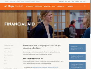
There’s nothing we love more than to see a department or office website officially make the switch over to the new Hope.edu website template and CMS. There are many reasons to love the new site: it’s user and mobile friendly, has consistent navigation, and is easier to manage. However, it’s also a nice aesthetic upgrade as well. See the before and after from our friends in Financial Aid as a prime example!

Congrats to the Firsts!
We would like to extend an enthusiastic congratulations to the History Department and the Office of Financial Aid on the launch of their new websites!
Since then, we’ve also been working hard with other departments and offices on their sites as well and have launched Campus Ministries, English Department, Public Affairs and Marketing, the Washington Honors Semester, and the Day1 Research Communities.
More new site launches will be coming soon!
Is your department ready to get started? See our spring website training dates.
New Website Training Dates
With the fall semester nearly behind us, it’s time to get ready for working on your websites in the spring semester. New dates for both OU Campus User Training and Writing for the Web are now available — please sign up below using the links below.
Although it may not seem like much has been happening since our big web launch this past summer, we’ve been hard at work behind the scenes. This past semester, we’ve provided content management system training to more than 75 people representing more than 50 departments, offices and programs. The new Department of History website was the first to launch, and there’s a growing queue of others that will be launching soon — several before the end of December. And we continue to provide support and assistance for people throughout campus. It’s been exciting to see the progress!
OU CAMPUS USER TRAINING
These two-hour sessions will provide an introduction to our content management system, OU Campus, and will give users hands-on training in creating and editing web pages.
User training is required for everyone in your department who will be performing hands-on maintenance of your website. However, space is limited to 20 computers per session; groups from the same department or office will be asked to share a workstation. Please limit the number of people from your department or office to three or fewer.
All trainings will take place in Martha Miller Computer Lab 240:
- Thursday, January 21, 1–3 p.m. (CLOSED)
- Monday, February 15, 3–5 p.m.
- Wednesday, March 16, 1–3 p.m. (RESCHEDULED 2/17)
- Wednesday, April 20, 3–5 p.m.
WRITING FOR THE WEB
If you already attended an earlier Writing for the Web session, you do not need to attend again. If you haven’t, please sign up online for one of the following sessions:
- Thursday, January 7, 9–10 a.m. (Maas Conference Room)
- Monday, February 1, 10–11 a.m. (Maas Conference Room)
- Friday, March 4, 1–2 p.m. (DeWitt Herrick Room)
- Tuesday, April 5, 1–2 p.m. (Maas Conference Room)
Begin working on your website
As a reminder, here are the steps required for your department or office to get started:
- Attend an OU Campus User Training session
- Attend a Writing for the Web session
- Draft a proposed site map
- Schedule a review with Public Affairs and Marketing to begin working on your site
About Those Site Maps
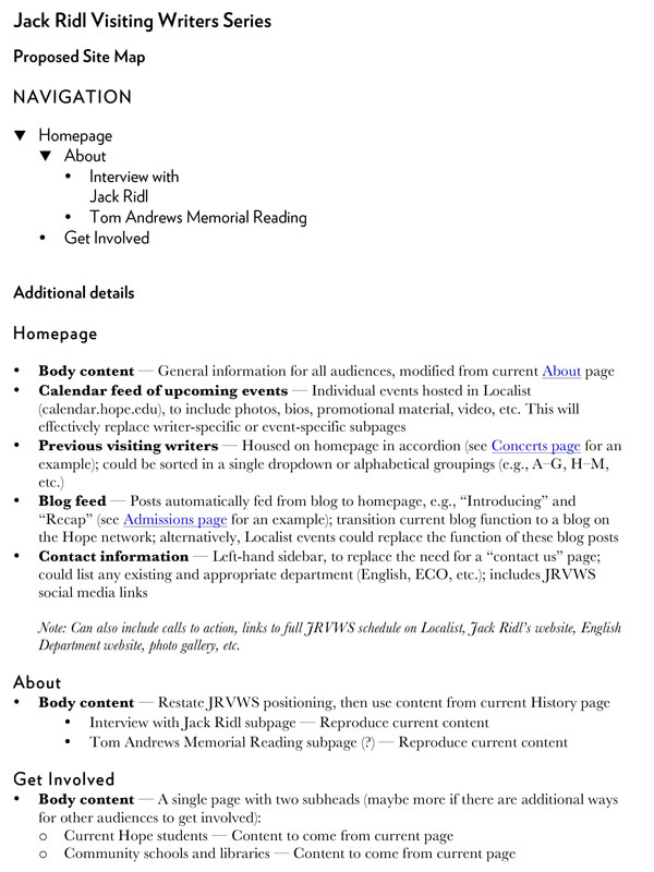
We’ve received a handful of questions about site maps — the third element in our requirements to officially kick off your office or department’s site construction — so I thought I’d take a minute to explain a little bit more about what we’re looking for.
The best way to do this is to follow an example, so I’ve included one here with additional, clarifying information below. The example is very short and includes only five web pages. Note two things:
1. The site map orders information in a logical way
2. The basic outline only includes pages and does not include additional detail until later in the document
So, as you’re putting together your site map, here are a few things to keep in mind:
1. Put your information in a place that makes sense
Don’t worry about how users actually get there; just think about where it lives. Want a high-profile way to draw users from your homepage to information about a particular scholarship? You probably need a Scholarships page in your Special Programs & Opportunities section, so put it on your site map — but don’t worry about your homepage content here. Answer the question, “Where does it live?,” not “How will people find it?”
It may help to think about this as a file structure. Identify the files you’re putting information in, and do it in a way that will help first-time users find what they’re looking for. Put pages in clearly labeled folders.
2. Keep your site map clean (additional detail comes later on)
You’ll want to be able to account for where all of your content goes, but that doesn’t mean every piece of content has to be shown on your site map.
Clarifying details aren’t bad — in fact, they’re quite good — but you should leave them out of your navigation. In our scholarship example from number 1 above, there’s no need to actually list the names of your scholarships in your site map. If it’s important to identify them, put them on page two.
You should end up with an at-a-glance, high-level view of the structure of your website. Make it easy to read, clean and clear. Make each page a bullet; make each child page a sub-bullet.
At the end of this process, we want a map that can be used as a blueprint for building individual pages. If it’s listed on the map, it becomes a page.
Fall dates for social media workshops
 Please join us at our next social media workshop, Setting up for Social Media Engagement, presented by our Digital Strategist, Elizabeth Council.
Dates Offered:
November 10 and December 3
2-3:30 p.m. in Dewitt Herrick Room
Elizabeth will cover content from two of her most-popular summer sessions in one convenient workshop. Together we’ll explore:
- What channels you should be using
- How to set up accounts so they are branded properly and can be managed efficiently
- Tips for managing multiple accounts
- Basics and best practices for identifying your audience and sharing content
- Simple tactics for starting a conversation and keeping your audience engaged
- How to respond to criticism from fans and followers
Hope College Web Style Guide
 Download the Hope College Web Content Style Guide.
We’ve all been there: You’re working on your department website and you can’t remember how to spell that building name. And is it the Philosophy Department or the Department of Philosophy? How do I make one of those backward-facing apostrophes for taking the 1 and the 9 out of Class of 1996? What numbers do I spell out instead of using a numeral, anyway? Do I use a comma in this list?
Until now, Hope College has just kind of winged it (wung it?). Every department and office has done its own thing, which is exactly what you’d expect; there hasn’t been a standard style that would allow users from all across campus to write in a unified voice. It’s one of the reasons the content on our old site has been sort of all over the place.
But when we write for our department or office, we’re really writing for Hope College. The style we use is an important part of our brand. So Public Affairs and Marketing has put together a Web Content Style Guide for Hope that will help answer your questions and ensure that every part of the website is using a consistent style.
We’ll be adding to and expanding this guide, and we’ll make new files available regularly. Of course, we encourage you to print a copy and have it within easy reach whenever you sit down to write for the Hope College website.
The truth is, I sort of nerd out on grammar and style. I’m more excited about this than I should be. So I’m going to share a couple of points that explain how I personally think about grammar and style. (I’ve picked these up from others along the way; they aren’t original to me.)
1. Grammar and style are practical ways of loving your neighbor.
As Christians, we’re called to love our neighbors (Leviticus 19:18). It’s one of the great commandments (Matthew 22:39, Mark 12:31). And one important way to love our neighbor is to make sure that when we speak to her, we do so in a way that she understands. To communicate with a person in a manner that is difficult or impossible to understand is an unloving act.
This approach does two interesting things:
- It puts a high priority on grammatical standards. Words, thoughts, sentences, paragraphs — yes, web content — should behave in expected ways that reinforce common conventions and meaning. I can’t put a comma at the end of a sentence and expect my reader to behave as if it’s a period. Shared rules of grammar exist to help make meaning clear.
- It places a higher priority on our reader’s ability to comprehend than on obeying every jot and tittle of the rules of grammar. This isn’t grammatical legalism. If your content is grammatically correct but difficult for your reader to understand, then you owe it to him as an act of Christian love to bend the rules of grammar — including those rules in the Hope College style guide — so he better understands you.
2. Grammar and style are questions of manners, not morals.
I speak differently to my grandmother — more politely, with greater deference and propriety — than to, say, my friends while we’re out on the town. In the same way, there is a time and a place to be a little more proper with our style and grammar (I’m thinking of formal communications, letters to the Board of Trustees, emails to President Knapp) than in other places (e.g., emails to coworkers, blog posts like this one).
It’s bad form to show up at a black-tie event wearing your swim trunks, flip-flops and a hoodie. But it’s equally bad form to show up at the neighborhood block party and pig roast in a three-piece suit. The question isn’t right or wrong; it’s appropriate or inappropriate — and answering that question depends largely on considerations that can’t be addressed by Mssrs. Strunk, White and Webster.
To sum up:
Know your audience, tailor your style in a way that is respectful to your audience and appropriate to your environment, and make your meaning clear. All grammar and style hangs on these commandments.


