Assets and snippets are two types of reusable content we use on our websites. If you already find the difference confusing, hang tight because we’re making a third type of reusable content available to everyone. We really do think you’ll like it because it will truly make your work easier.
Components will allow you to generate specific types of content using a form entry field instead of building the content on the page.
Craig has been hard at work building a selection of components for you to use, but I’m going to focus here on the Featured Person component (formerly the Featured Person snippet) — not only because it will show you how to use that particular component but because it should give you a good idea on how to use the other components, too.
As a reminder, this is what the Featured Person content block looks like:
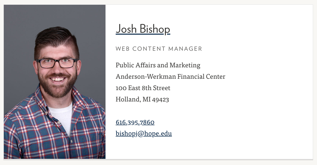
We initially created this to mimic a faculty/staff listing, but people have been repurposing it for other types of content, and the results have been mixed. Additionally, behind the scenes is a clumsy table transformation that requires users to use some basic html. It looks like this:
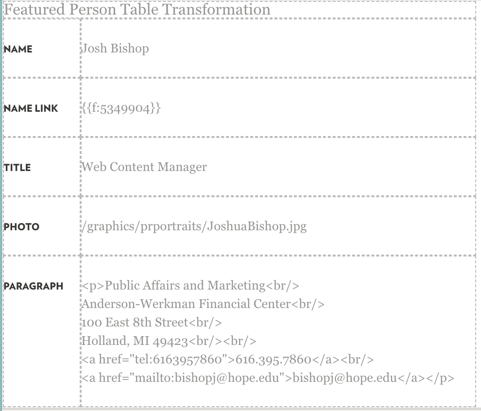
It’s not the most complicated thing ever, but it’s also something of a pain. Which is where components come in.
Here’s the new process for adding a featured person content block:
In the Main Content region of your page, put the cursor where you want the component to appear, then hit the Component button in your WYSIWYG toolbar. It’s next to the snippet and asset buttons, and it looks like this:
![]()
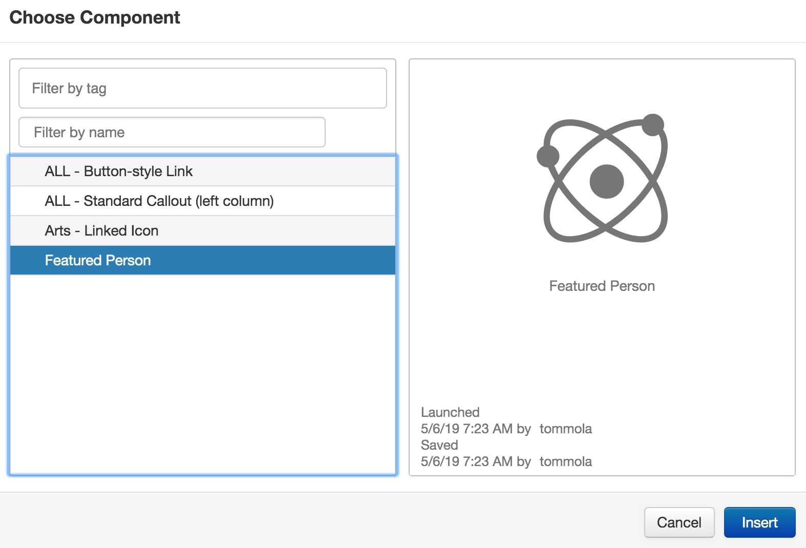
Then, select Featured Person from the list of available components and hit Insert:
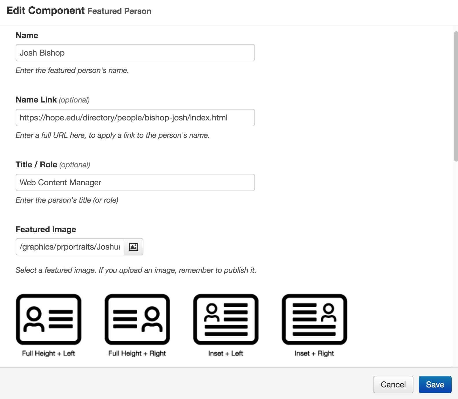
A form will appear, so you can fill out each field with the name, title, link, etc. Notice that there are some new options, including a choice of photo layout and an optional button. If you want to replicate the original featured person card, just select the first photo option: “Full Height + Left”. Here’s what my component form looks like:
And you don’t need to know any html because it has a handy text editor built right into the component:
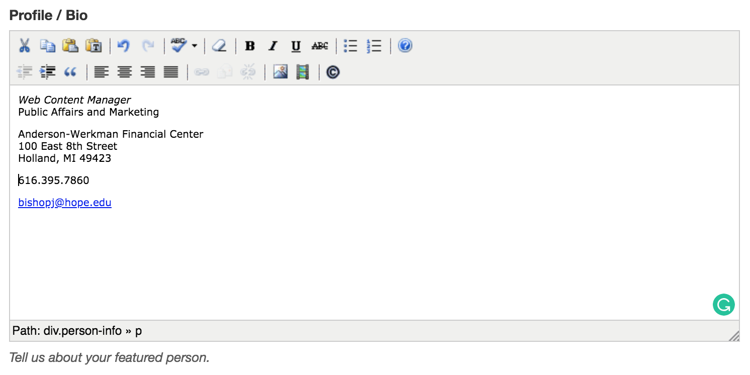
When you’re done, hit save! Your new component will look like this in the editable region:

To edit your component, just click anywhere in the blue pill, select the pencil icon, and make the changes you need:

Here’s what the finished product looks like with no button and with the photo set to “Full Height + Left”:
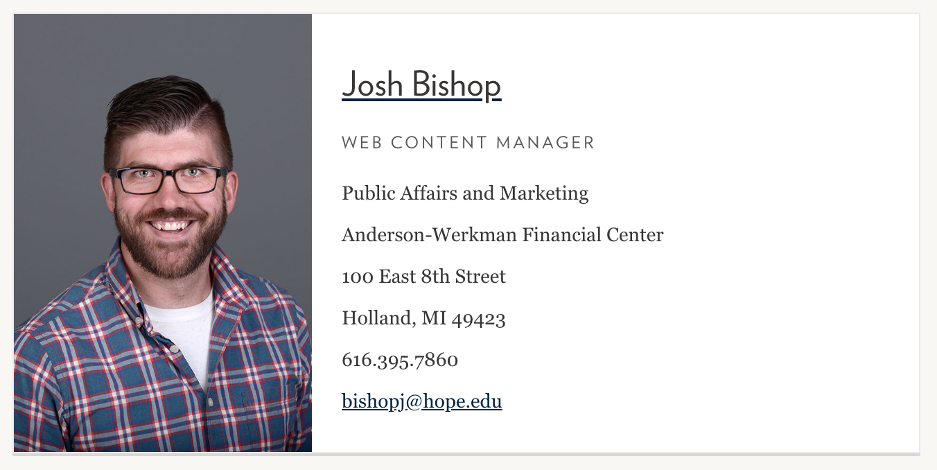
You’ll notice that it looks almost exactly like the previous way of building it as a snippet. The only difference is that it’s a whole lot easier to use!
Finally, here’s what it looks like with the button and the photo set to “Full Height + Right”:
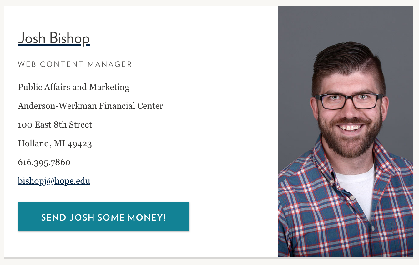
Note that we only recommend the Inset photo option for relatively long content — longer, at least, than these faculty or staff listings. That format will work best for lengthy paragraph-style content.
There you have it! Feel free to play around with the other components. As usual, if you have any questions or run into trouble as you try the components, just let me know!

